Wednesday, February 25, 2009

Osbourn Park Logo


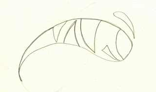
This is Osbourn Park high schools logo of a yellow jacket. This is the high school I attended and it was a great. I really like this logo of a yellow jacket but, as Gerry and I were noticing, it is so overused. As I was looking around at other peoples old school logos and they seem at least a little original. The logo looks great to me but it is so cleche. A lot of pro sports teams use this image and it would be refreshing to see something a little edger and creative. I feel that the best logo of mine is the most simple for of the yellow jacket. I like how it has a contemporary new feel to it with out screaming an image. A big part of high school is trying to feel unique around people. If your high school is being represented by a used up logo how can you feel original and new? I think a fresh new appeal will give other local high schools a run for their money. I feel like this new logo (with a little tweaking) could really represent something new and exciting. The school colors are blue and gold and incorporating them in a more artistic way shows fresh unique ideas, which would be a great way to represent your high school.

Logos


Logo Sketches


Thursday, February 19, 2009

Sunday, February 15, 2009

Design Crit

I chose this advertisement because of her use of design. Her color use is strong because it is in the same family of color, the shades of brown used in the picture reflect the background color. The hint of blue is fitting for this because there is an element of contrast and movement across the page. It draws the viewers eyes to the font. The use of proximity is in effect here with the placement of photos. The big picture on top is balanced by the three lower pictures. The lower pictures are creatively placed with one another with a balance of background color (light vs. dark). Alignment is shown is this advertisement with borders being strong and even as well as creative in the placement of the two smaller pictures to the right of the second biggest image. The corners still match each other making them fit together but the designer is still making a conscious decision to break it up and be bold. Over all, I think the composition of this piece is strong and appealing. The only thing I really have a problem with is her centered text. Like Robin Williams said "Never Center!". Its too safe and mild. The word Lace can be centered but it may be visually stronger if she broke the contact information up a little bit. Maybe place text on the lower bottom right and left sides of the page.

New portrait

Wednesday, February 11, 2009

Sunday, February 8, 2009


Frida Kahlo (July 6, 1907 – July 13, 1954) was a mexican painter who used vibrant colors and a mix of cubism and surrealism to express herself. She painted numerous self portraits with personal life experiences incorporated in them. This portrait above is one example. She was in a terrible accident with a bus and a trolley car leaving her bedridden for months in a full body cast. She used this time to learn how to paint and used herself as her subject matter. Most of her work was self portraiture. She suffered terrible bouts of pain throughout her back and legs from the accident all her life. Her work was twisted and kind of creepy which I really like.
I chose her because of her influence on me. She is emotionally inspired and I love her creativity. She used a simplistic approach to her work and it works. Not a lot of shading and blending to create depth but has great attention to detail. I am attracted to her work also because it speaks to many women. When she was pregnant and miscarried she was depressed and expressed herself through a series of paintings which a lot of women can relate to. Its very raw, sad and personal. As an artist, she has greatly influenced me and my ambition to express myself. I love how her work is aesthetically appealing due to its graphic nature and awkward approach. Its originality is unique to her and will forever be influential in the "art world". She is political, honest, raw, beautiful and forever immortal.

Tuesday, February 3, 2009

Sunday, February 1, 2009

Design Crit 2

I chose the apple ipod image that really speaks for itself.  I think this photo is visually intriguing because of its use of color contrast and negative space.  The colors are strong against the black silhouette image of a girl showing movement having a fun approach to advertising.  Her movement shows that she is definitely feeling her music and action is important with music advertising.  The simplicity of the stark white background is strong against the layer of colors and the layer of the black image.  Simplicity is appealing to me because it makes a strong point.  You don't need a lot of "stuff" to get your point across to the viewer.  The logo apple uses and the small text "ipod" next to it in the upper right hand corner is all you need.  I also thought it was cool that the actual ipod is white making the background come into play without overdoing the product.  Overall its a fun image that conveys movement, music and artistic freedom from the norm.